Rogers Centre Refresh
From over 200 different colours of paint to 4.
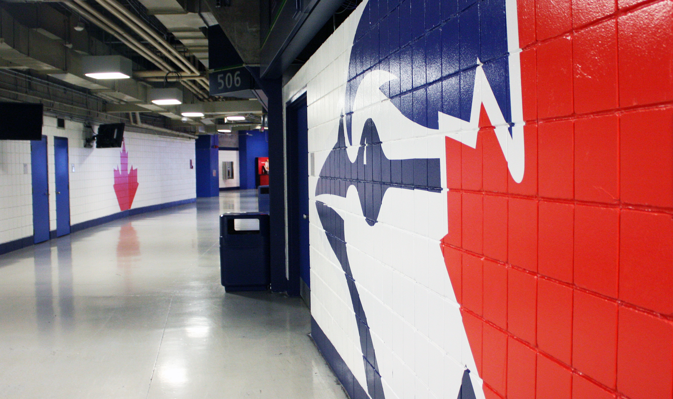
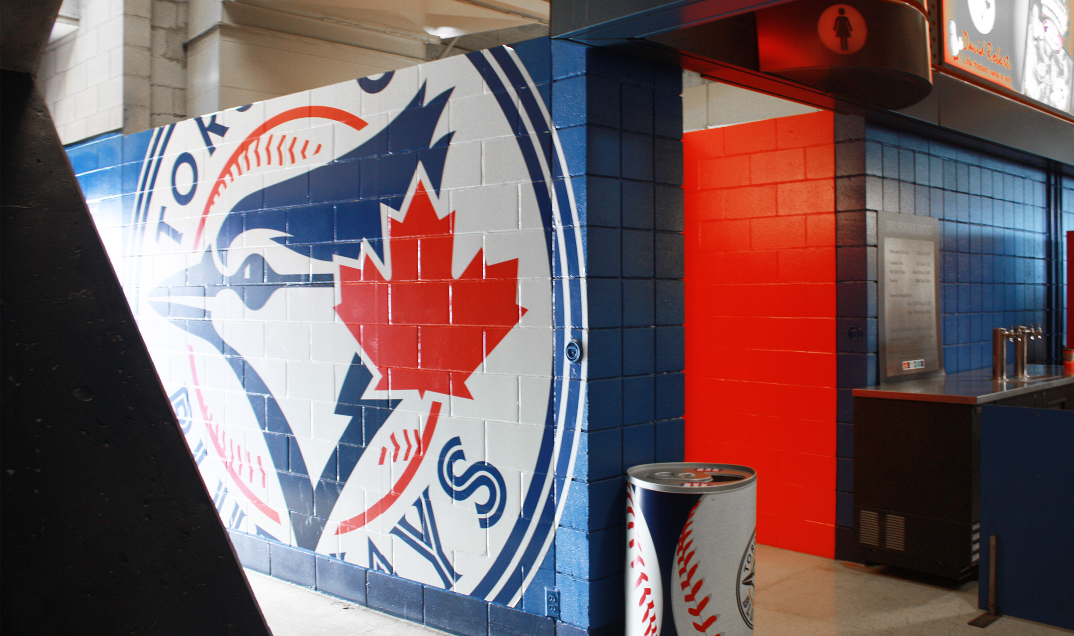
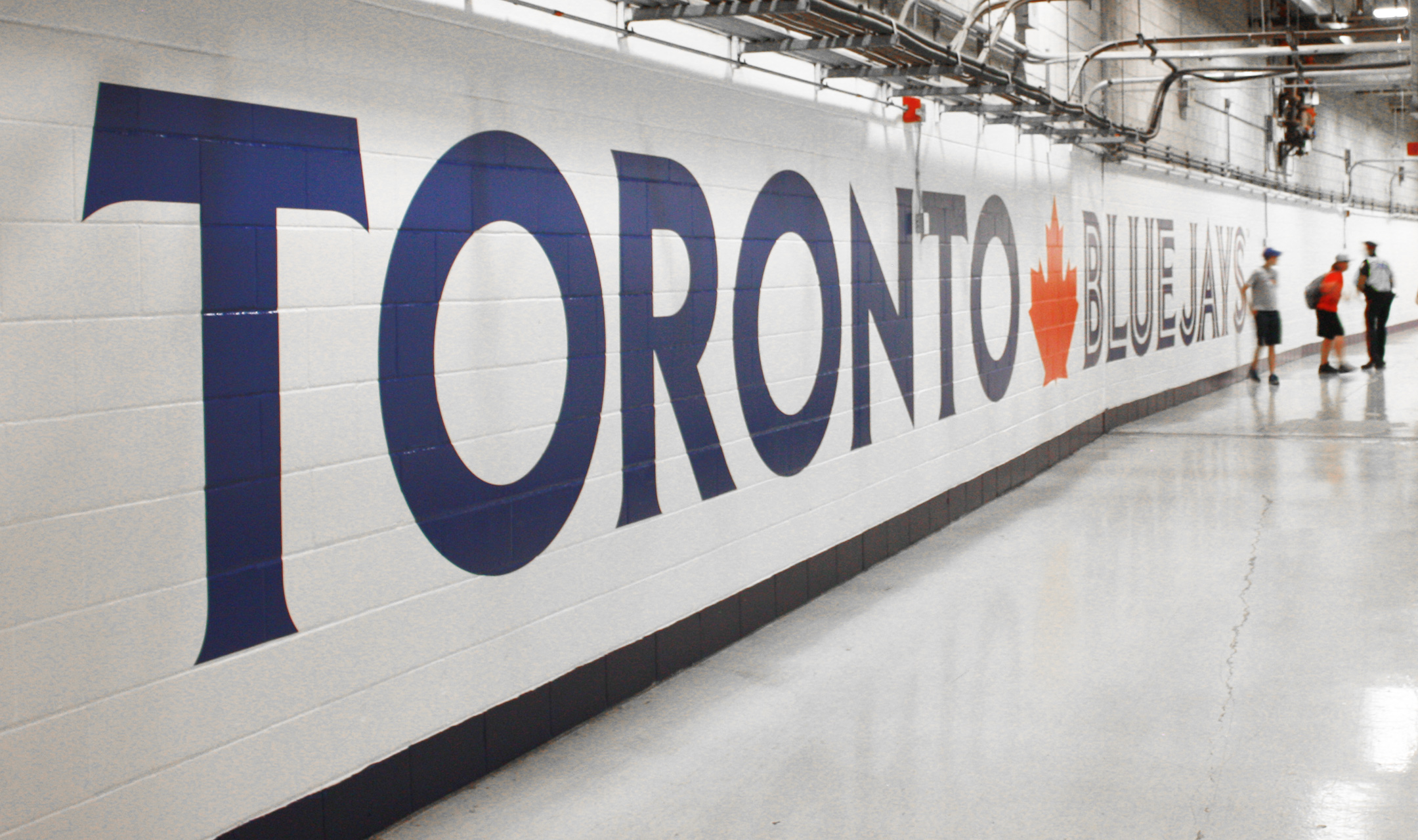
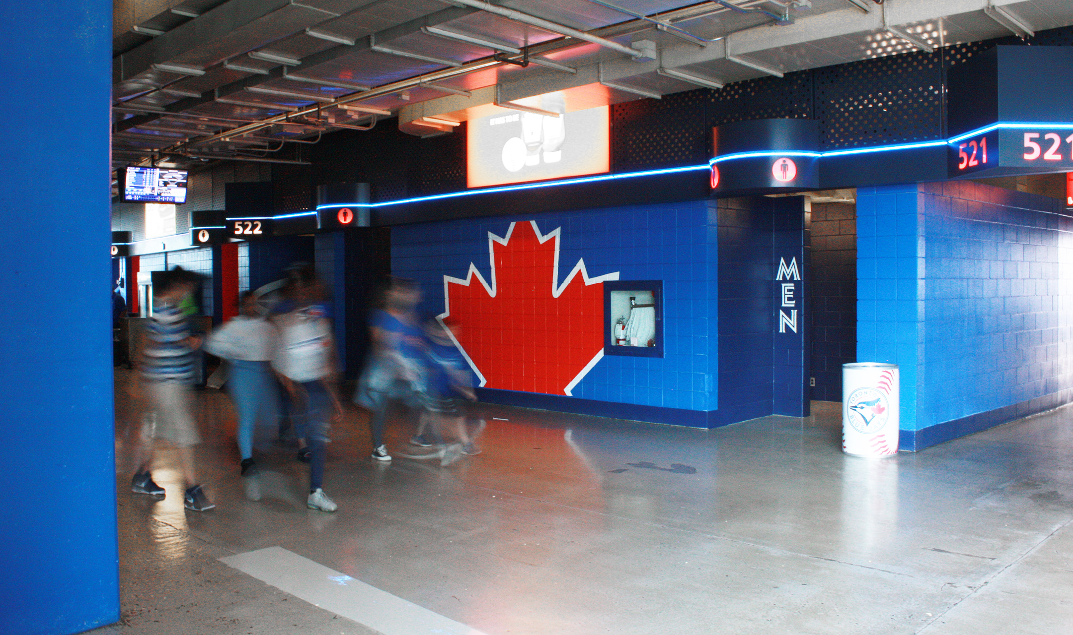
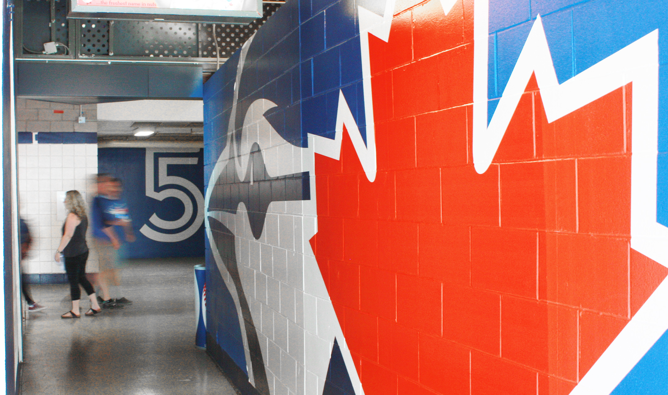
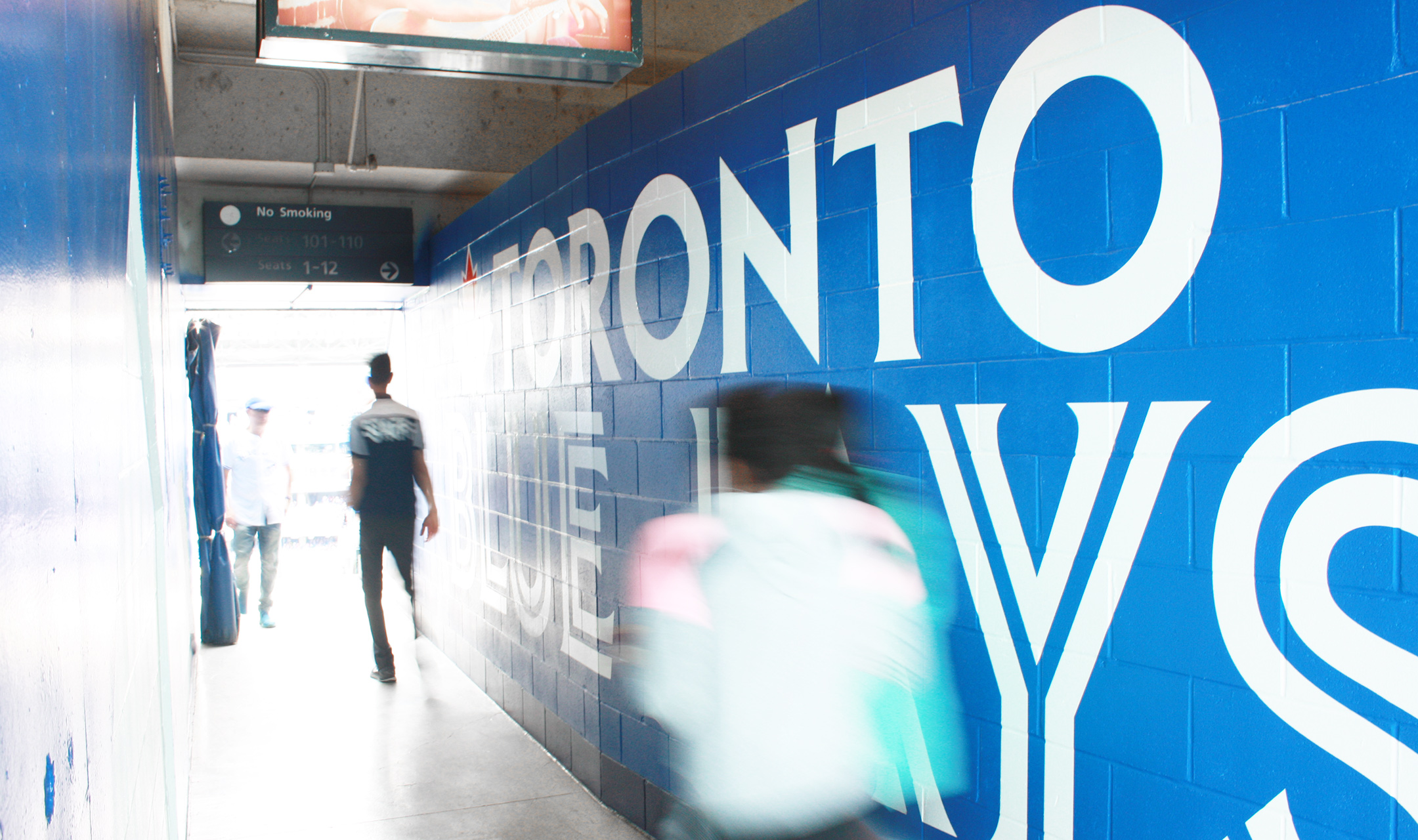
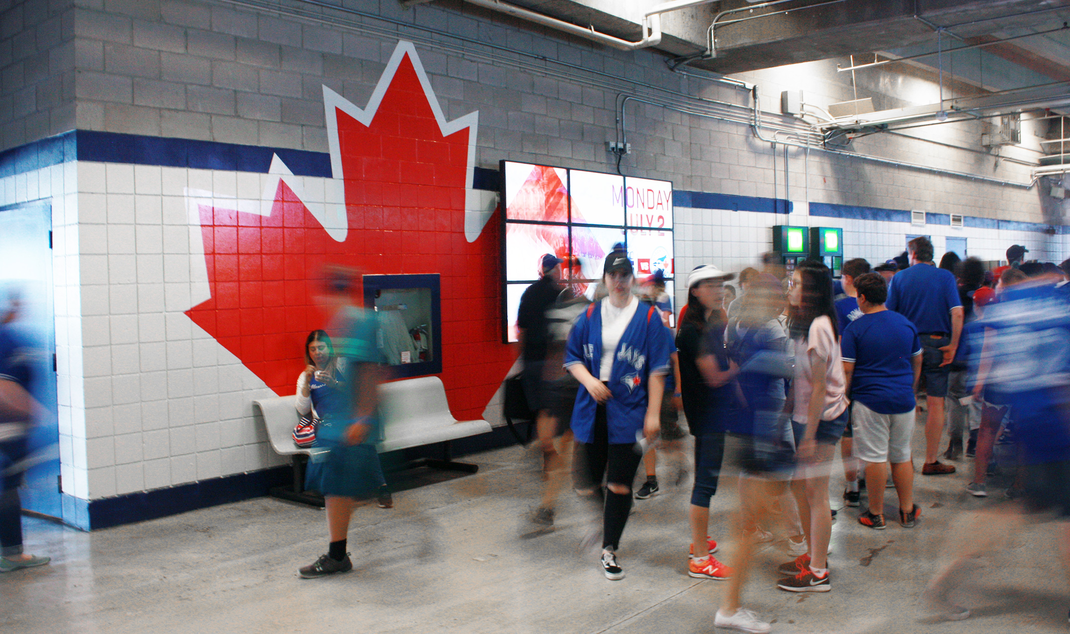
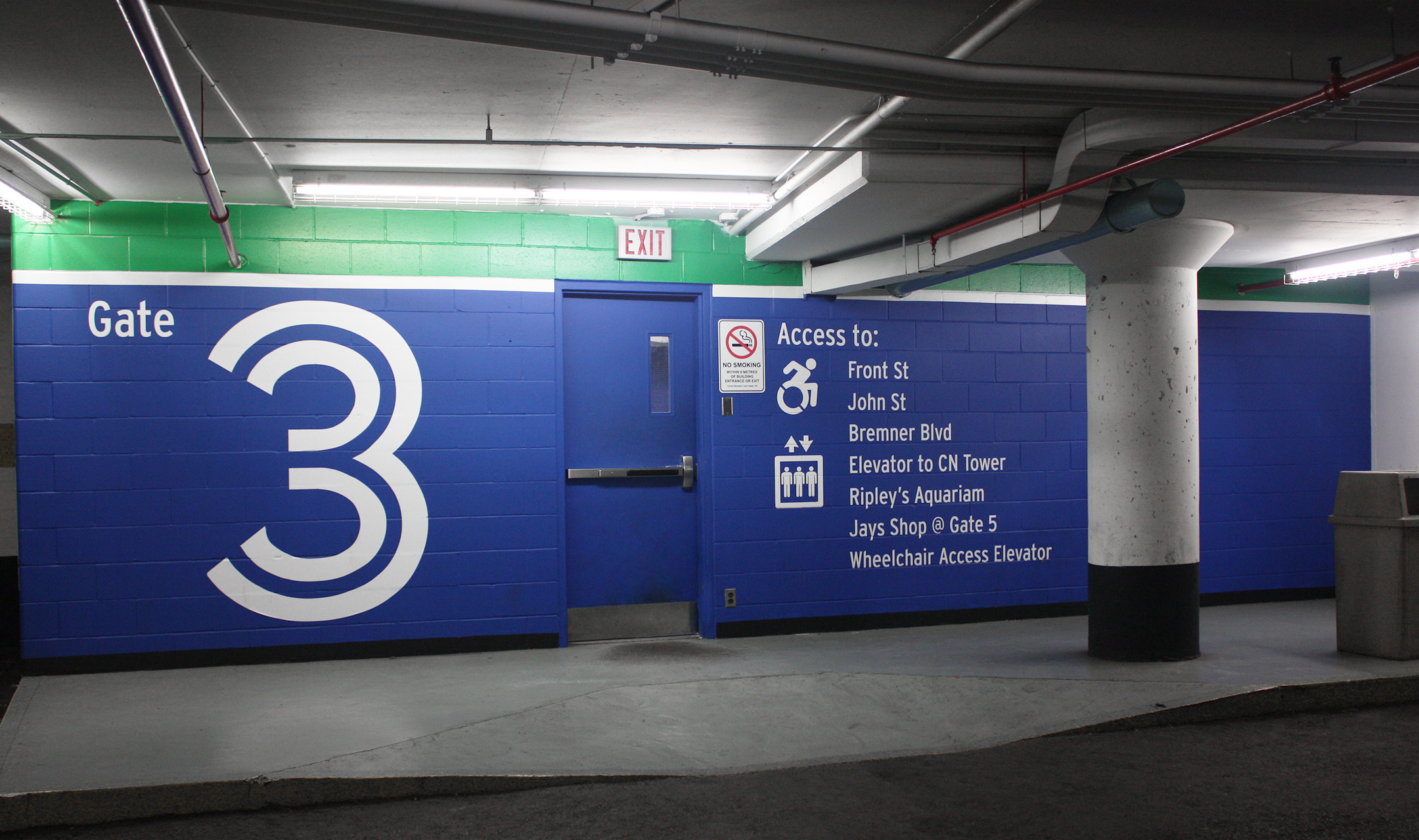
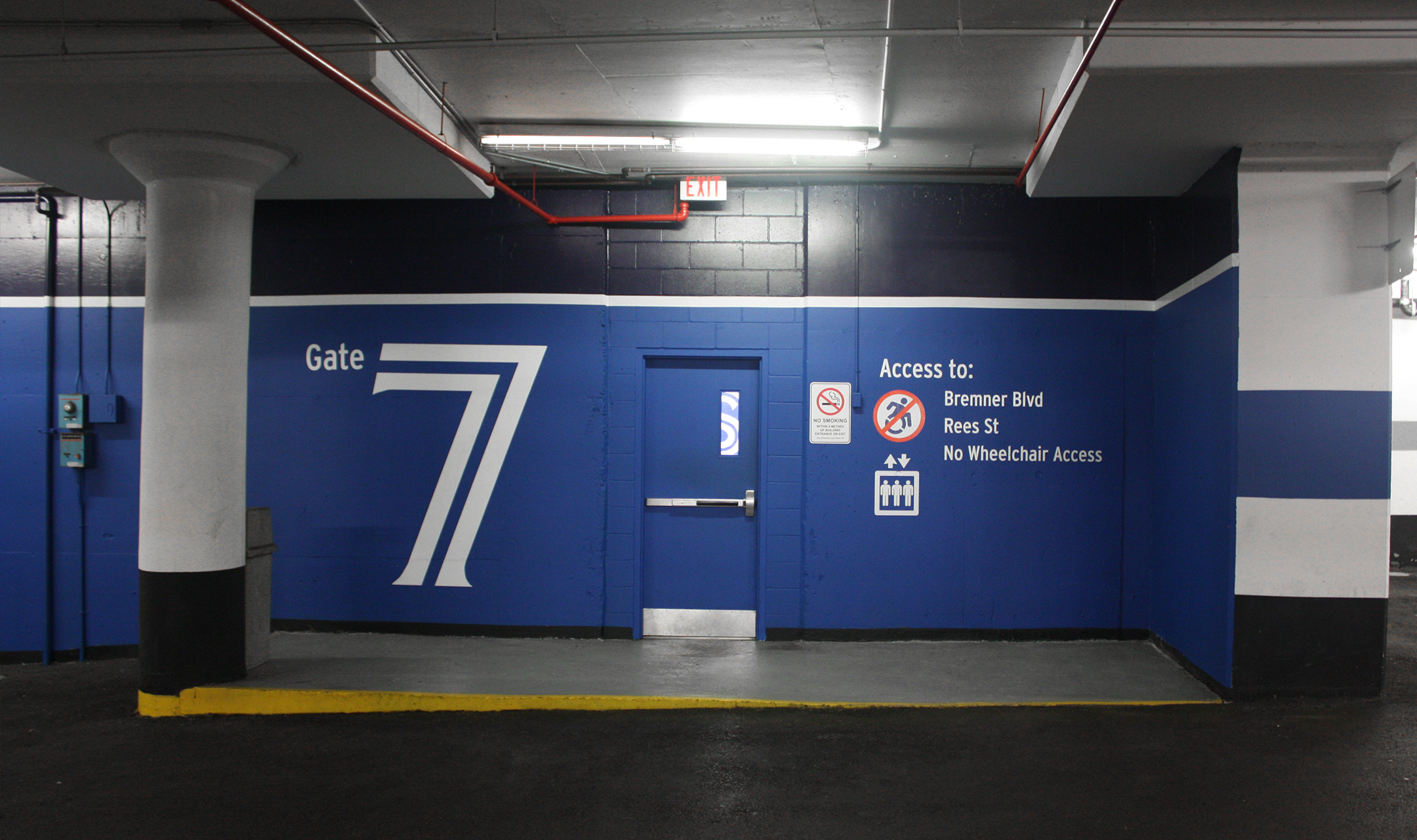
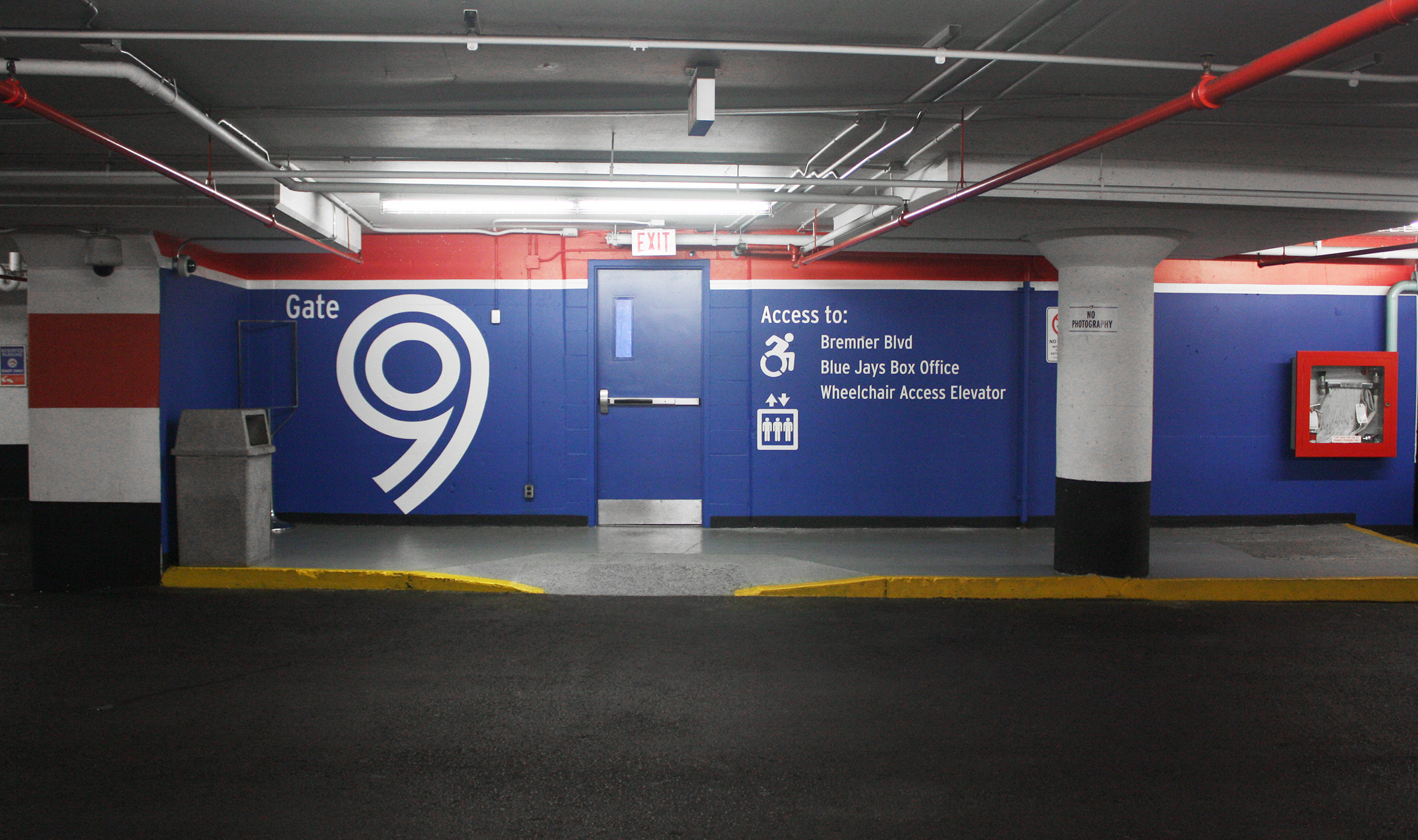
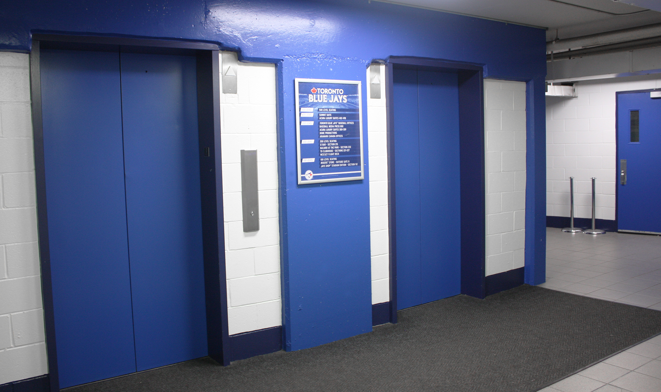
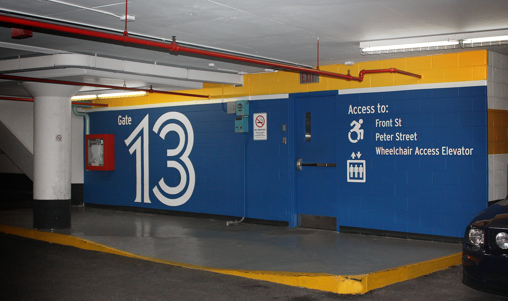
The Rogers Center had out-dated branding and a very-busy colour scheme. The objective was to make it more appealing to fans in order to enhance their experience while at the same time refine the look to echo that this is where the Blue Jays play.
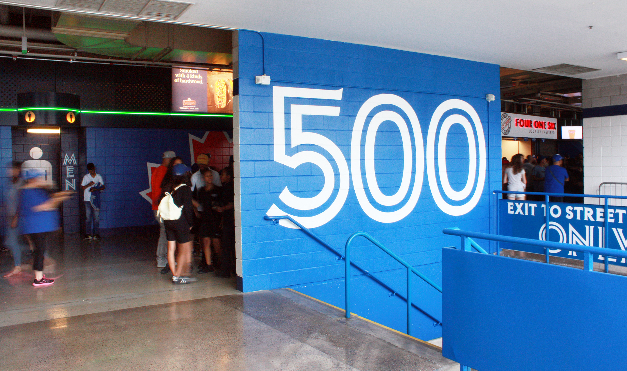
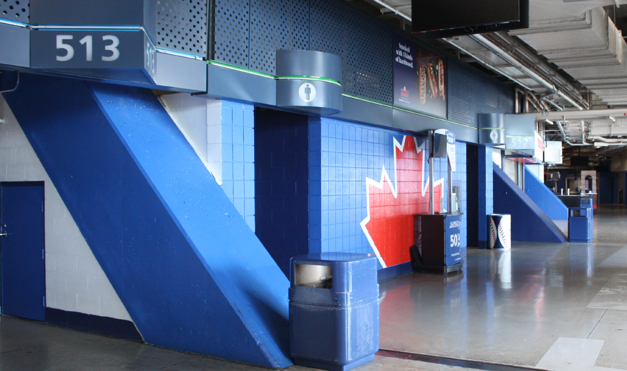
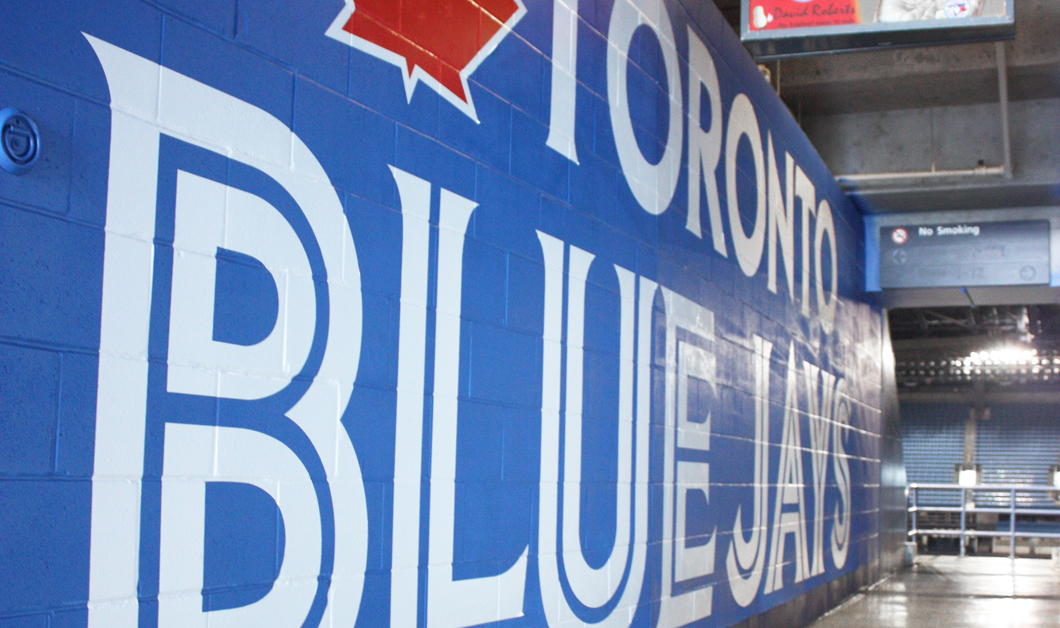
The solution was a modular colour-scheme approach which was utilized to highlight the uniqueness of the Rogers Centre interior architecture.
Due to the volume of people that attend games, large branding elements and oversized numbers and lettering are utilized so wayfinding can be seen (and read) over the sea of fans and from a far distance.
Art Direction | Graphic Design | Identity | Print | Wayfinding | Experiential
- Home
- Logos
- Kubota
- Rogers Centre Refresh
- East York Curling Club
- R Company
- 2021 All-Star Push
- Bubly
- Jr. Jays
- Players Dining Area
- CanHuck
- Ticketmaster Lounge
- Blue Jays Classic Font
- 2017 Season Campaign
- 2016 Season Campaign
- 2016 STM Packaging
- A.L. East Division Championship Packaging
- 2015 Season Tickets and Packaging
- Quazar
- 12 Bar
- McDonald's Proposal
- Promotional Giveaways